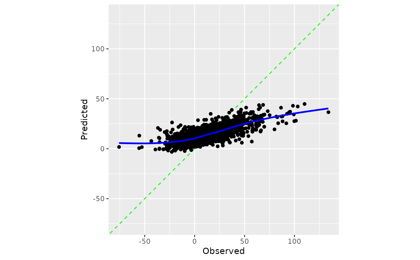
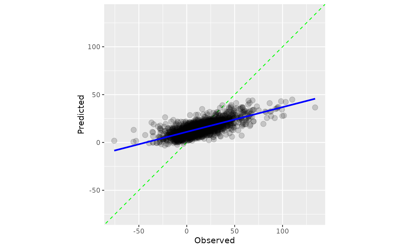
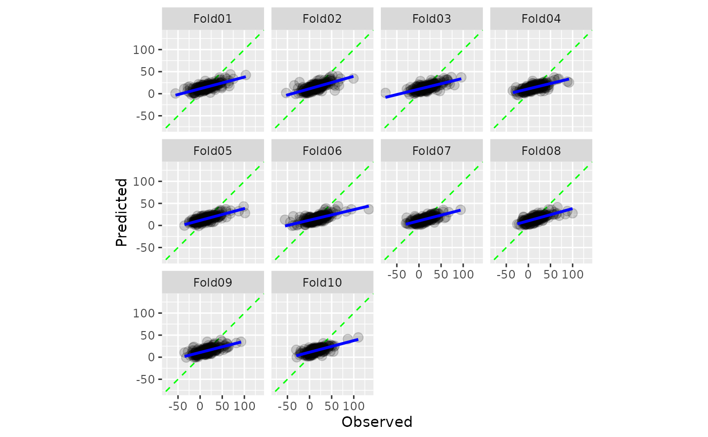
A scatter plot of the observed and predicted values is computed where the
axes are the same. When smooth = TRUE, a generalized additive model fit
is shown. If the predictions are well calibrated, the fitted curve should align with
the diagonal line.
Usage
cal_plot_regression(.data, truth = NULL, estimate = NULL, smooth = TRUE, ...)

# S3 method for class 'data.frame'
cal_plot_regression(
  .data,
  truth = NULL,
  estimate = NULL,
  smooth = TRUE,
  ...,
  .by = NULL
)

# S3 method for class 'tune_results'
cal_plot_regression(.data, truth = NULL, estimate = NULL, smooth = TRUE, ...)

# S3 method for class 'grouped_df'
cal_plot_regression(.data, truth = NULL, estimate = NULL, smooth = TRUE, ...)
Arguments
- .data
An ungrouped data frame object containing a prediction column.
- truth
The column identifier for the true results (numeric). This should be an unquoted column name.
- estimate
The column identifier for the predictions. This should be an unquoted column name
- smooth
A logical: should a smoother curve be added.
- ...
Additional arguments passed to
ggplot2::geom_point().- .by
The column identifier for the grouping variable. This should be a single unquoted column name that selects a qualitative variable for grouping. Default to
NULL. When.by = NULLno grouping will take place.